

Cairntrips is an app that allows users to plan a hiking/camping trip in one spot. This idea came while I was taking the UX/UI design course from coursera. For me, planning camping and hiking trips has always been stressful as there's no good way to stay organized with all the trails and campsites needed to plan a full trip.
A hiking/camping trip planning app
Overview
The Challenge
Hikers and campers need a place where they can fully plan a hiking/camping trip.
Individuals planning a hiking and camping trip encounter many difficulties, even if they are experienced in doing so. These may include finding trails and campsites close to each other, keeping what trails they want to hike organized, or just not having the time to research all the trails they want. There is a large gap when it comes to organizing a trip like this, which CairnTrips aims to solve.
Objective/Goal
Our Hiking and Camping Planning App will let users plan their hiking trips without committing to reservations which will affect users who have irregular and unpredictable schedules by letting users plan which trails they want to go to and what equipment they need.
My Design Process
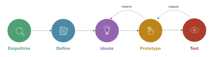
Empathize/Define
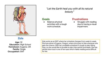
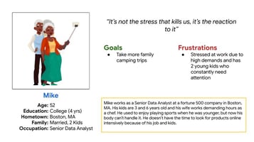
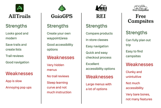
Through my initial research I came up with two user personas, Zola and Mike. Using those personas I was able to come up with some user journey maps and goal statements, which allowed me to see some areas that I could improve in. This competitive audit was done on four hiking and camping related companies; All Trails, GaiaGPS, Free Campsites, and REI. I really had a ton of fun with this as it let me dig deep into each of these websites and apps and I was able to find pain points in each one.
Do you research the trails/campsite you plan to go to ahead of time? Where would you go to find this information?
Do you like to have a scheduled itinerary when going on hiking/camping trips? Why or why not?
Do you use your own camping gear when going on hiking/camping trips? Why or why not?
What makes you want to go on hiking/camping trips?
Research Questions
Ideate
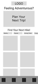
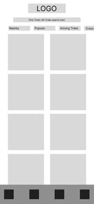
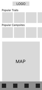
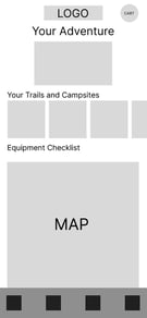
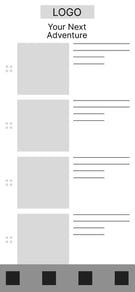
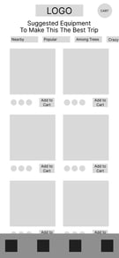
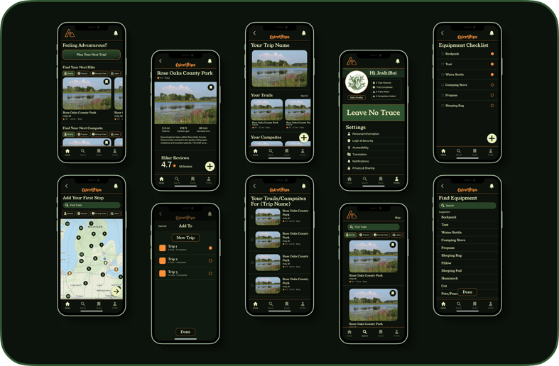
After the competitive audit I was ready to craft some storyboards and eventually these wireframes. These show the flow the user can expect when they go to plan a trip through this app. Starting at the far left is the homepage, the next frame is where the user would go when they click the "Plan Your Next Trip!" button, then the trail/campsite finder, after that the app will suggest equipment for those trails and campsites, then the users' trail/campsite list, and then after the user saves and names their trip is the trip overview screen.

Prototype
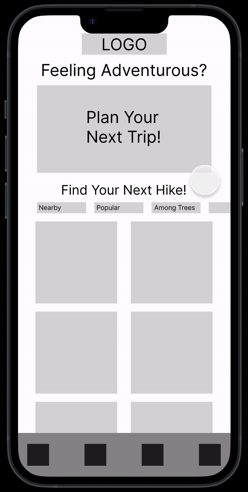
After some usability tests on the Lo-Fi wireframes, I moved on to completing Hi-Fi prototypes in Figma. Throughout this designing phase I decided to massively change the layouts of most of the Lo-Fi wireframes. This allowed for a better user flow and experience as it made the app much less cluttered. I definitely had the most fun with this part of this project because visual design is my biggest interest in UX/UI design.
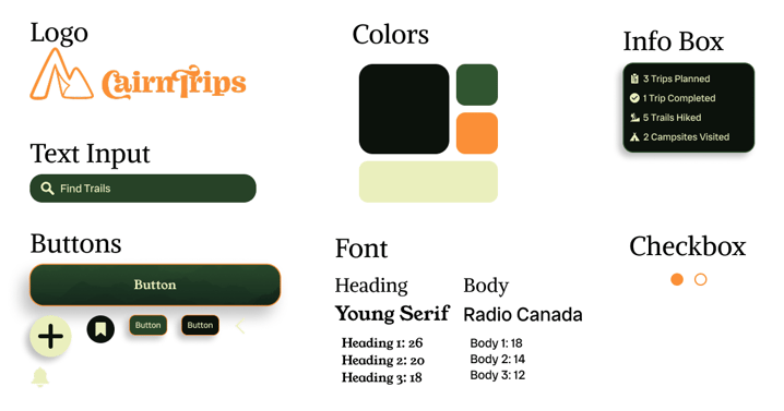
Branding